


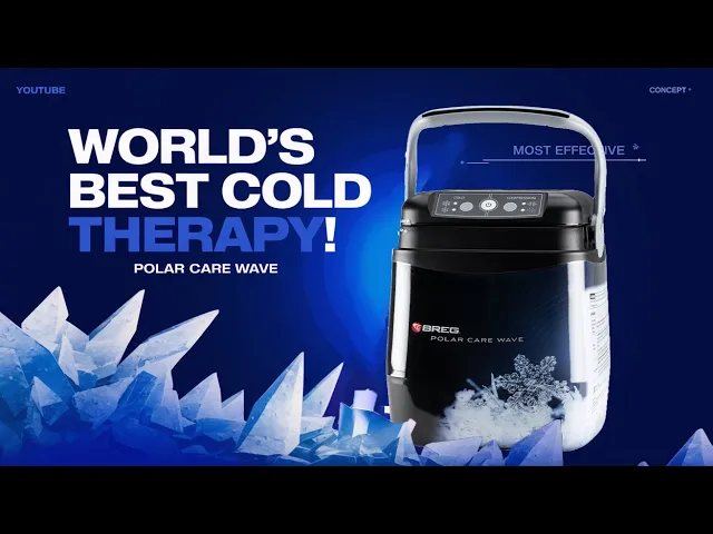
Breg is the largest manufacturer of cold therapy products in the U.S. The Polar Care Wave is a cold and compression therapy system designed to reduce swelling, manage pain, and accelerate healing after surgery or injury. Users use a keypad interface to control therapy modes and respond to device alerts during recovery.
See our patent
Send Message
Role
Product Development Engineer
Team
Product Management, Software, Quality, Regulatory
Company
Breg
Accessibility
Software Specs
Human Factors
Safety/Regulatory
Systems
Usability

My Role
I drove end-to-end human–machine interface design and core product development.
I engineered core functional elements of the device, including patented features. I translated research into interface requirements, defined therapy control logic, and authored software activity diagrams for implementation. When usability testing revealed safety risks, I led cross-functional efforts to simplify the interaction model while considering cost impacts and development time.
The Core Problem
Post-operative patients require effective cold and compression therapy, yet many existing systems are unnecessarily complex.
Immediately after surgery, patients are often medicated, in pain, and mentally fatigued. Navigating therapy modes, adjusting compression levels, or responding to device alerts becomes difficult. This can elevate the risk of misuse or underuse.
When evaluating our competitors (whose products were 4x the price), we noticed features that were overdesigned to the point of confusion.
GameReady - Cold therapy competitor
Competitors introduced challenges with accessibility and usability:
Higher cognitive load for patients in recovery
Excess therapy settings beyond clinical necessity
Multi-step interactions to change therapy levels
Poor visibility into active therapy state
Higher price points driven by unnecessary features
Design Principles
Insights from competitor testing and patient interviews shaped the direction of the product.
Reduce cognitive load during recovery
Patients in pain should not need to navigate complex controls.
Communicate system state clearly
Users should instantly understand what the device is doing at any given moment.
Design to prevent misuse
Design the product so it guides correct use naturally, even without reading instructions.
Design Process
We simplified the interface to only what users actually needed.
Post-operative patients want relief, not options.
Research and competitive analysis showed most systems offered more therapy levels than necessary. We reduced the interface to two therapies (cold and compression) with two intensities (high and low).
By narrowing choices to what was clinically essential, we made operation faster and more intuitive.

We validated clarity through formative usability testing.
I moderated a usability study in which participants assembled the device, powered it on and off, adjusted settings, interpreted keypad symbols, and diagnosed errors without instructional aids.
Simplifying the interaction model reduced hesitation and improved clarity:
• 15/15 participants successfully completed keypad tasks
• 14/15 correctly interpreted symbols; one misread the compression icon, leading to refinement
• Average setting adjustment time was ~1 second, significantly faster than competitor designs
We reduced use errors through physical interaction cues.
While the digital interface tested well, usability testing revealed an unexpected issue: 15% of participants misassembled the cooler lid and handle, creating potential leakage risk.
To address this, we evaluated:
• A mechanical redesign — high cost and delayed timeline
• Expanded IFU instructions — simple but easy to overlook
• Built-in visual orientation cues — low risk and immediately visible ✓
We designed labels for assembling the device. Follow-up testing showed 100% correct assembly.

Outcomes
The final design strengthened clarity, safety, and trust across the system.
The final system reduced friction and increased patient confidence.
100% task completion in follow-up usability testing
Passed formal validation requirements
Submitted product for FDA approval and met launch timeline
The Polar Care Wave remains a flagship product in Breg’s cold therapy product line.
Post-launch messaging highlighted simplicity and ease of use, reflecting our usability-first design approach
Product Design Takeaways
Simplicity creates confidence.
Users don’t need every possible mode. In recovery contexts, fewer decisions and clearer states increase trust and reduce hesitation.
Testing reveals system-level problems, not just interface issues.
The keypad performed well, but testing exposed a physical assembly risk.
Design for vulnerable states, not ideal users.
People in pain are not in a learning mindset. Interfaces should reduce interpretation and support recovery.
A glimpse into our product in the market!


Patients in pain should not need to navigate complex controls.