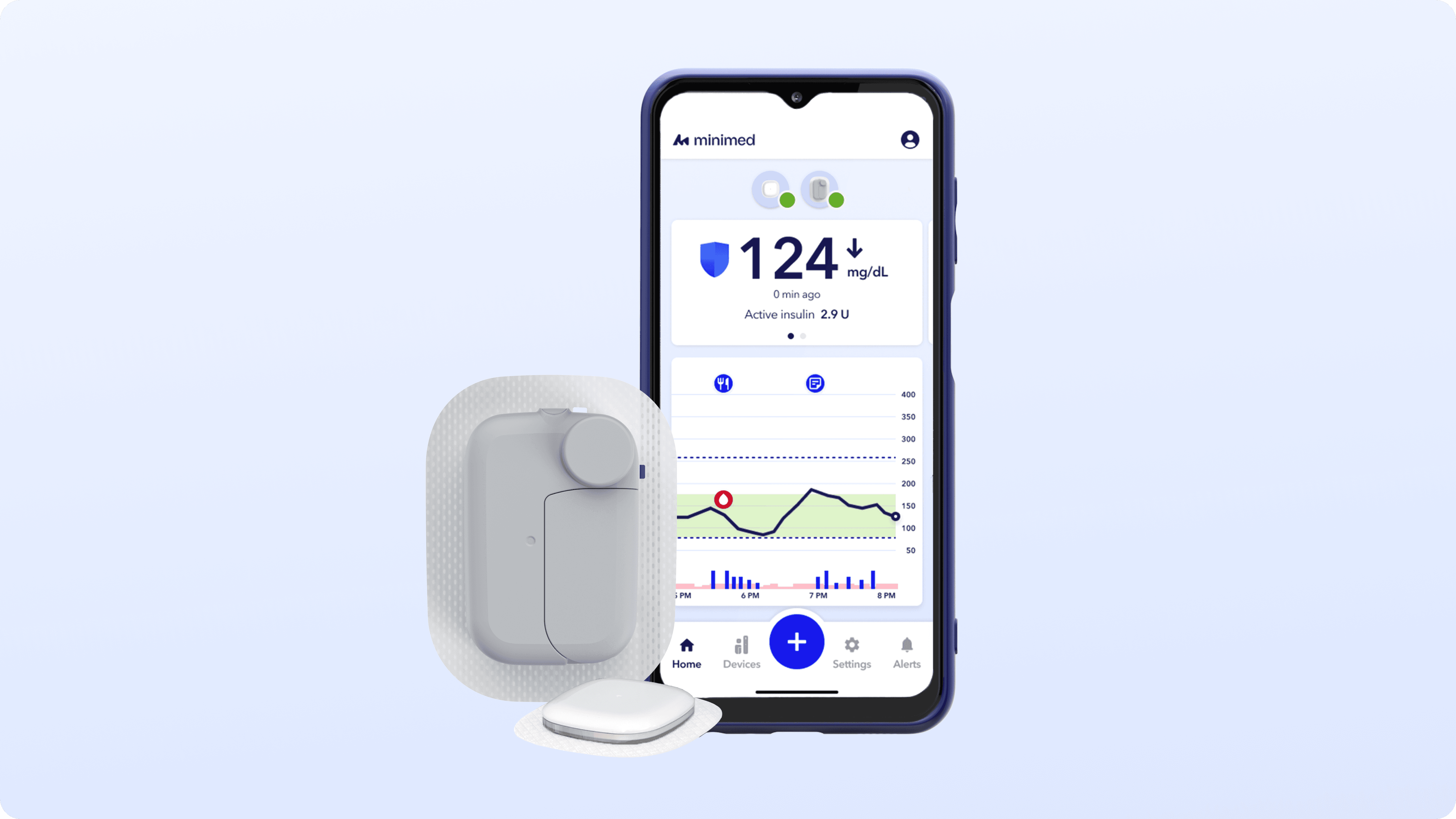
This new patch pump system integrates a wireless insulin pump, continuous glucose monitor (CGM), and mobile app to deliver real-time insulin therapy for people living with diabetes. Patients monitor their health status, devices, and insulin delivery, often in time-sensitive moments where clarity is critical. As the first 5-day, fully wireless patch pump, it expands portability and freedom. With that portability comes added system complexity to design for.
Role
Senior UX/UI Designer
Team
Product, Engineering, Human Factors, Clinical, Regulatory
Company
MiniMed (formerly Medtronic)
Data Visualization
Systems
Usability
Error Handling
Visual Design
Cross-Platform

My Role
I led the end-to-end design of safety-critical features across the patch pump ecosystem.
As the only company that builds both the insulin pump and continuous glucose monitor (CGM) in-house, Medtronic manages a fully integrated therapy ecosystem within a single app. I drove the design of features within startup, device management, error handling, notifications, and therapy/prescription settings. I worked cross-functionally with engineering, clinical, and regulatory teams to define constraints, validate through usability testing, and deliver production-ready designs.
The Core Problem
Patients with diabetes need to constantly check their health data but can't afford to add more burden in their daily routines.
They open their app dozens of times a day to manage their insulin pumps and CGM sensors. They aren't just casually scrolling for a quick distraction. They are thinking, do I need to eat more sugar? Why aren't I getting any insulin? What's wrong with my pump? Can I trust what I’m seeing?
In a safety-critical system, ambiguity isn’t just confusing. It’s risky. When blood sugar is unstable or a device unexpectedly enters a warning state, even a few seconds of uncertainty can delay intervention.
Previous insulin pump app undergoing re-design

The previous app needed refinements:
Key device health information was buried in navigation, requiring guesswork instead of quick recognition
Busy visuals and inconsistent color usage diluted the meaning of urgency cues
Severity was not clearly communicated, making it difficult to distinguish informational states from critical ones
Managing devices and resolving issues lacked clear pathways, leaving users unsure where to take action
Design Principles
After reviewing previous designs and user feedback, we aligned on principles to guide key product decisions.
Clarify required action
Users should immediately understand what requires action versus what is informational.
Simplify decisions under pressure
During high-stress moments, the interface should feel simple, calm, and reassuring.
Create system consistency
Products should communicate using similar logic and language to enforce familiarity and trust.
Design Process
We unified device status into a single severity language across the entire ecosystem.
To address ambiguity, I created a consistent severity system applied across alerts, modals, and device status indicators. This included standardized color usage, iconography, labeling conventions, and escalation behaviors to clearly distinguish between informational, warning, and critical states.
Modeling various statuses of insulin pumps and CGM sensors

We explored multiple layout models to balance completeness and clarity.
The wireless insulin pump contains two batteries: an active battery powering the pump and a secondary backup battery that activates when the active battery is depleted. Device info is shown on the home screen so the user knows when to change their pump to avoid a delay in therapy. The challenge was determining how to present the most critical information without overwhelming the primary interface. We explored different layouts:
Option A: Split Metrics
Show insulin level and wear time on one slide and battery levels for both batteries on another
Option B: Split Batteries
Each battery displayed on its own slide
Option C: Active Battery Only
Only the in-use battery shown at a glance

We reduced cognitive load by prioritizing the information patients actually act on.
Testing revealed that users primarily focused on the active battery and largely ignored the inactive battery during routine checks. While we thought the extra battery information could be useful, denser layouts increased scanning effort without improving decision-making.
We prioritized having Option C: Active Battery Only on the home screen. This reduced visual noise while preserving access to secondary battery information elsewhere in the app.
We modeled failure states to ensure safe edge-case handling.
We didn’t just design for things breaking. We designed for real-life moments, like when it’s time to change the pump and users aren’t sure what comes next. By clarifying system states and next steps, we reduced guesswork. In usability testing, participants were able to independently navigate pump changes and resolve common errors without additional guidance.
Pump modal states indicating battery, insulin levels, and wear time

Device errors requiring the user to take action

We established a clear visual and audio hierarchy for alerts.
One of the biggest pain points patients shared was alarm fatigue. Whether in a meeting or a movie theater, many said they “just wanted the pump to stop screaming at them.”
When routine notifications carry the same weight as critical, life-threatening alerts, users become desensitized. We reorganized alarms by urgency, clearly distinguishing critical alerts while making lower-priority notifications less intrusive. A new “discreet mode” allowed users to reduce sound in public settings without compromising safety.
Patients shared that having control over alert settings made the pump feel less disruptive in daily life, while still keeping them protected.

Outcomes
We created one consistent language across the system.
User validation showed faster recognition of action-required states, clearer differentiation between device statuses, and reduced confusion around complex system behaviors. Participants reported improved clarity and time in understanding overall device health. Users could access device management from multiple entry points throughout the app, making for a predictable experience.
Engineering collaboration ensured technical feasibility across software and hardware constraints, resolved edge-case error states, and coordinated timelines to keep development on track.
Stakeholder alignment ensured the severity system met FDA standards, maintained clinical accuracy, and established a shared framework across product, systems, and regulatory teams.
Strategic Learnings
Design for edge cases, not just happy paths.
Resilience is built in the “what if” moments, not the ideal ones.
Clarity over visual complexity.
Less is more! For users in rushed or stressful moments, attention gets narrowed.
Think in systems, not screens.
Interfaces are only one layer of a product. Effective design considers logic, constraints, data flows, and real-world context.